
Yesterday I blogged about the launch of an A/B test phase for a new home page for Second Life and complained that it was hard to comment on it without seeing it (which is what the Lindens asked the community to do). I’ll give all credit to the Lab: they posted a screen shot…I hope it was because of the comments on the forum asking for a look!
I’ll give all credit for their original decision as well: don’t show a screen shot because people might comment. Maybe they were right in the first place. Because without being able to interact with the new home page, it’s possible we’re all missing the little ‘wow’ that would come with whirling images or sound or whatever it is that makes this a way to “introduce potential new users to the wonders of Second Life which cannot be expressed with a 2D static image,” as M Linden commented on my blog yesterday.
“There is so much that we want to show people about what exists inside this wondrous world!” he said.
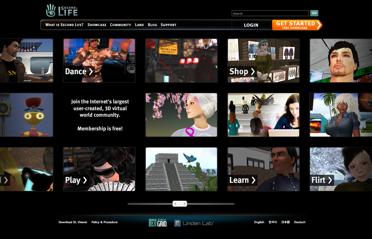
Wondrous maybe but I wonder whether wondrous includes unique?
Papervisiony
I mean, the first thing that sprang to mind when seeing the new design were, well, 90% of the applications being developed in Papervision these days.


Maybe it’s a good thing to “fit in” with the latest trend in design, or whatever, although I always pictured Second Life as a world of its own.
Is Flash a Barrier to Entry?
I also commented yesterday on the barriers to entry by using Flash. And I’ll let the A/B tests figure it out, I suppose. I know they promise that you can go the ’static’ route: but where’s that button again? Or am I missing it? Does it ONLY take place at the loading screen? I suppose once you’re in you’re in.
It’s so difficult to evaluate without being able to play with it, I guess. And the proof is in the testing. I’m just skeptical.
And so are others, in particular Crap Mariner who does such a, um, beautiful job explaining concerns with the interface:
“Looked up some of my old notes: “Black is not an inviting color. You do not go into a black space. Our brains are wired to prefer light spaces.”
Once again, grab whatever wrist-slashing Goth who put together this piece of garbage, rub them with raw hamburger meat, show them the door, and then release the hounds.”
What concerns me is the possibility that this will also be the direction of the new user interface design: if I’m not mistaken, Big Spaceship is helping with that as well, and there are already screens designed according to a previous note from M.
But hey, keep us posted on the A/B test, it’s new users that matters for this little slice of the SL first hour. But if it’s going to start invading the rest of the SL interfaces (how about a Flash-based JIRA?) I’m not sure whether this will lighten my mood or not.


[…] Edit: Since this post, the Lab seems to have listened to the community and provided a screen shot of the new test home page. See it and comments here. […]
So, it’s not just a lousy introduction and misrepresentative of the product, but the proposed home page is a lame copy of a popular product?
Wonderful. (Vomit)
it looks really bad! i hope they don’t go with it!
ugh. The criticisms of this design is completely predictable, and IMO, completely off the mark. Everybody is predisposed to declaring this a fail, I guess because everyone wants to be justified in saying that LL can’t do anything right and Big Spaceship doesn’t “get SL” and has no business designing the interface.
So its derivative? So what. *Every* design is derivative. Every one. Design, especially commercial design, exists within its time and echoes current trends and styles or else its not timely. Web sites are not designed for the ages. They’re designed for the here and now, and in 3 years when this looks dated and stale, they should be designing a new look. And, anyway, its a grid of images. Who owns the rights on grids?
And “Basic Rules of Design”? Are you kidding? I have a Rule of Design too. “Those who quote ‘design rules’ should never be allowed anywhere close to a design in progress”. Rules serve only one purpose: to be waved around by non-designers when they want to reject a design out of hand.
There are no “Rules of Design”. A design serves its purpose or it doesnt. THAT is the only rule that matters.
In the rush to cry “Fail”, everyone’s completely missing what this design actually does really well.
The flat black actually works very nicely, despite “rules” to the contrary, by receding to the background and focusing attention where it is supposed to be, the pictures, which look like windows into a world. There are so many possibilities and things to do in this world that they had to be arranged in a grid which is still too big for the page and has to overflow to the right and left. That’s how much stuff there is in SL.
Someone also said “Never horizontal scroll. Always vertical scroll.” Another one of those “design rules” which is just rubbish. Again, design choices have to suit the purpose and the message. For me, horizontal scrolling conveys “open”, “panoramic”, and “unconstrained”. All qualities that Second Life should be communicating. Vertical scrolling suggests sequentialness, and lots of stuff I have to read through.
And that’s without even knowing what kind of interactivity there’ll be on the live page. Who knows what clicking the menu items or the verb boxes will do? Or what’s beyond the page to the right and left?
Remember, the one and only purpose of this page design is to entice the new visitor to click deeper into the site and learn more. Now there’s no telling how well the live site will perform and if it will be annoy people away with too much Flash gimmickry. That’s a very strong possibility.
But, based solely on the layout of this static page, I say it works. If I was visiting this page for the very first time, having never heard of Second Life, I would be intrigued enough to look deeper, and I think many many other people would too. And THAT is the only measure of success that counts.
Ok, whatever. I’ll tell you why it doesn’t work for me. It’s the HOME page. THE landing spot. Not a linked page. And your eyes don’t know where to rest. You go left, then right, looking for an edge, a boundary, and they aren’t there. Combined with the black background, it hurts my eyes to look at long enough to figure out what they are trying to say.
And did you even read Crap’s mention of the verbs they chose? Stupid. I don’t think anyone’s found those meaningful.
If you didn’t already know what SL was, this page wouldn’t help you one bit. As for the predictable criticism stuff, I was neutral on it, and in fact was hoping they’d come up with something nice and useful. I have nothing against LL, if anything I probably come down on their side of things more often than not, just because incessant whining by the residents irritates me.
THIS. SUCKS. It has nothing to do with anyone wanting anyone else to fail. They failed without our wishes.
I think the eye naturally moves to the single empty box on the page. The one that contains the main message, “Join the internet’s largest user-created blah blah blah”
“And your eyes don’t know where to rest. You go left, then right, looking for an edge, a boundary, and they aren’t there.”
That’s the whole point. There is no boundary! That’s why the thing SCROLLS to right and left!
We know it scrolls. It’s still NOT a home page design. It’s a photo album design.
It conveys no cohesive message, but many fragmented ones, and the user has no idea which one to look at first. You’re looking at it as someone who already understands SL. You’re not looking at it from the point of view of someone who needs one simple statement answer to the questions : what and why.
What bothers me are the keywords, “dance, shop, play, learn, flirt” !!!! OMG…. that ought to destroy all credibility for business and education. Perhaps the Lindens are trying to drive business and education out of the SL Grid and into the pricey Immersive Spaces platform.
The design doesn’t matter if the first impression is that SL if a frivilous environment. Hope MY CEO doesn’t see something like this…bye bye budget!!
[…] And for those who missed it, here it is again, and don’t miss the comments on my previous post. […]
What it also shows is that their ideal resident is human. This was supposed to show what SL is about? What about all the communities in SL based around non humans?
I applause LL for trying to revamp and attract punters making it easier for them to join/assimilate into the societies but they should be trying to celebrating all the aspects of SL.
*shrugs* i am still waiting for a newbie out of the box furry av… seemed it was missed when they remade the others.