
Arguing about design is like arguing about wallpaper, or whether you like Monet or Manet: it’s very difficult to even frame the terms of the debate, let alone decide who won it. There have been attempts, recently, to try to figure out the world’s “Best Art” by applying mathematical formulas. If you ask the experts, they’ll choose this:

So it’s with great trepidation that I step further into the debate about the Second Life home page design, unveiled by Linden Lab yesterday, to spirited and heated commentary by current residents.
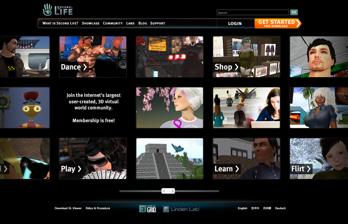
And for those who missed it, here it is again, and don’t miss the comments on my previous post.
We Are Not Qualified
And that’s a problem right there: because in using the word “Residents” the first argument back is that it’s not the current residents that matter, it’s whether the new home page attracts new ones. So let the data tell the story: A/B tests and all that, track the click-throughs, parse it by domain, monitor the ‘time spent’, all that kind of stuff, and if it performs better than the current site, well, we have a winner!
The second problem is that the art, science, and accident of interface and Web design means that in the absence of usability data, of tests and focus groups and whatever other measurements you come up with, we can all argue that “hey, it’s subjective, get off your high horse”. In my business, I long ago learned that I can never win an argument with a creative director, or a Jakob Nielson fan, or for that matter someone who made their own Christmas cards.
My only recourse is strategy and intent. And I can often be wrong about strategy and intent, just as a designer can end up being wrong about a design (you just can’t prove it until its proven in the market). But it’s one way to frame a discussion, anyways, and sometimes by framing it, we can all shift our perspectives a little bit and maybe take a new approach, or at least see how totally at odds we are and call it a night and hope that in the morning it won’t matter, or it wasn’t as important as it seemed in the first place.
Strategy, Intent and Goals
So what do I mean by strategy and intent? It’s not so difficult, really, and sorry for the marketing 101 or whatever (I’m making this up as I go along, here). What it means is that someone tells a designer to design a THING. And if that’s all they do, then that thing will be whatever the designer damn well pleases and you can hardly argue with them.
But if you tell a designer to design a THING whose intent is, say, to attract new users to Second Life, well clearly that changes how the designer frames their decision process. And if the intent is right, and the design is OK, then you can test the intent against results by doing A/B tests, holding a focus group, whatever.
But strategy is a bit different than intent. Strategy is the REASON you have the intention you do. Now, the Second Life blog is silent on this. I know it LOOKS like they’re not, because they have goals, and they talk about optimizing the experience for the new user, but those aren’t strategies, those are different ways of expressing INTENT. They’re tactical.
The strategy, we can partly imply from M Linden’s many discussions of the topic, is to “improve the first hour”. By improving the first hour, the idea is to attract and retain more users. And I’m going to go out on a limb here and say that the Lab’s reasoning is that if you can get them past the first hour, they’ll discover all the deeper stuff, the things past shopping, or the first prim, or the first night out in a club, or the first class on Kabuki theater or whatever it is.
Scoop ‘Em and Serve ‘Em
So, the strategy, as stated so far at least (and I suspect there are unstated strategies) goes something like this: if we can attract and retain new users, through all the means we can, like Immersive Workspaces, and a new home page, and a simplified registration, and whatever else we can come up with - then our ‘population’ will grow, the network effects of the platform will increase, and because this is a user-generated world we’ll keep seeing amazing things happen which will CONTINUE to increase new users, which we’ll be better at getting past the first hour….and we’re off to the races.”
This isn’t technically a strategy, by the way. But we’ll leave it, it’s all the Lab has given us so far, and I don’t feel like debating what the strategy behind open spaces might be.
So, the intent of the home page design, therefore, is to increase the percentage of people who click through to the registration page.
Attracting people in the FIRST place is a different issue. Getting them to STAY is a different issue. All we need to do is get them to click through to the registration page, right?
Well, sure. Who cares really. If it does the trick, it does the trick - and the home page does a neat trick of giving folks a whole screen full of pods. Actually, make that multiple screens, because scrolling is really just multiple screens, they’re just embedded in one. And we meet our goals:
“* Express the richness and breadth of Second Life
* Allow us to address a wide range of potential Residents
* Set context for what a potential Resident might do in Second Life”
In other words, throw enough reasons for the surfer to click through, give them a hint that there’s a lot more behind the curtain, and work hard in the meantime at grabbing them by their lapels and yelling at them in German, Japanese or English to STAY.
Fair enough. So what’s the problem?
Big Ideas
Strategy, intent and design come together in something called creative. And I mean big Creative here, which is different from design, although design can be and expression of Creative. Words can also be Creative. The phrase “Just Do It” is Creative.
Creative is the intersection of strategy, intent, copy, design, testing, insight, epiphany, research….whatever it is that all those big agencies get paid to do, sometimes with horrible results, sometimes with iconic symbols that last for generations. Think Marlboro Man. “Think Small”. “Think Different”.
Big C creative is based on big IDEAS, usually expressed in very simple forms, which communicate values, feelings, beliefs, features, aspirations and hopes in a way that is effective for the fulfillment of strategic intent: to move specific markets, for specific reasons, against the backdrop of competitive and other forces, while possibly changing the way people live and work or the cultures in which those things happen.
Big C Creative was at play in the following line: “Your World, Your Imagination.”
Those four words were big C creative. They expressed a value proposition, they were emotional, they attracted a specific audience, they had embedded within them possibility, and yet were contained within the metaphor of a “world”.
I would propose that the following things are NOT Big C creative:
“Join the Internet’s largest user-created, 3D virtual world community.”
“Membership is free.”
“Dance, Shop, Play, Learn, Flirt”
Pods
Black
Flickr stream look-alikes
But It’s Just a Home Page
Sure, it is just a home page.
And it’s also intended to be your first “official” exposure to the Second Life brand (until they start their ad campaigns or viral videos or whatever sometime in the coming months).
And it’s also the first creative expression we’ve seen that goes beyond tweaks and usability enhancements. Unfortunately, as such, it becomes a rallying point for new users, for Big Spaceship, for the usability guys at the Lab, and for the current Residents.
And there’s nothing to rally around.
This isn’t to say that the rest of it won’t somehow bring all this together - maybe the ads, if any run, will have a catchy slogan or a big idea. Maybe the revamp of the rest of the Web site will somehow integrate some other over-arching idea that we haven’t seen yet.
Second Life is a Photo Booth
But frankly? Based on this, I doubt it. This isn’t “Your World, Your Imagination” anymore.
Second Life is now a giant photo booth. A photo booth where you scrawl little words on the pictures or whatever so you remember them years from now, or you were too drunk that night, or you couldn’t really remember WHO the person was beside you, on the left, you just know their name was Sue, or Bob, or Flirt, or Dance.
See, the problem with the new home page design isn’t the design. It’s that the design isn’t guided by any big idea. It’s not guided by big C creative.
It’s driven by a tactical intent: to yank in more users. And users these days love Flickr, and Papervision is all the rage, and black is cool in these oh so cheerful times.
The home page was JIRA’d. It was a task-oriented problem, and we can close the ticket now and move on.
Unfortunately, passion for a brand, LOVE of a brand, starts from that very first interaction, whether it’s walking into an Apple store or recognizing the gold wrapper on a box of Godivas or whatever. If we’re asking the new users to begin their experience of entering Second Life by visually positioning it as a giant photo booth, with no rallying text or expression of dreams, with no metaphor for a world of imagination beyond that, then at least we can all take comfort in the fact that with a 10L fee for taking photos in Second Life they might at least be able to count on a slight uptick in their revenue stream.


I’m not a huge fan of the home page… but that aside, even if they get people in… chances are a good percentage of them would end up in an (un)welcoming area and end up feeling bullied, harrassed or disgusted and will leave.
I sometimes do self imposed penance at the (un)welcome areas to help those in genuine need - and I really hate being there.
Perhaps if Linden care so much about new users, they’ll make the welcome areas a little more like the Destination Station (help people find and move on to interesting spaces). Or maybe they’ll dedicate some staff to these areas to assist.
Linden relies heavily on residents to mentor and assist which is all fine and well, but if they care about their bottom line - perhaps they want to make sure people pass go and decide to collect L$300… instead of giving up after being in an (un)welcoming area for a little too long.
The home page may be the first point … but who survives in SL seems to strongly hinge on who has contacts to help them out of the (un)welcoming area; who has the ability to search (and find somewhere that makes them want to go on) or who happens to by chance meet someone friendly and helpful.
If they’d fix these entry points, I’m quite sure they’d have a lot more people stay in SL after they’ve joined instead of giving it up as an awful experience in banality.
Very well said
A lot of good thought there, Dusan. The thing I’m wondering about is why the SL blogosphere calls for LL to “change this” and “improve that” and then when they begin to do something they immediately start getting criticized.
It’s obvious they are laying down the cash to try to make some improvements. I’ve seen Big Spaceship’s work and even watched some of their process via lynda.com. I highly doubt this is some thrown together job. Isn’t it a little early for anyone to trashing to whole effort when it has just begun? Is there NO hope at all? Personally, when I read who was involved in this project, I was actually excited.
Busting on LL is easy…hundreds are doing it. I think the real challenge for SL bloggers would be to write about all the really good…really cool things that go on every single day.
I’m very interested in what all you guys have to say, but I have to tell you…you all collectively paint a dismal picture. Perhaps that is part of LL’s problem.
I’m not a Linden. I’m not a “fanboi”. I’m just a guy who really enjoys his SL…warts, bloggers and all.
Luke:
You make an interesting point but what you seem to be critiquing here is critique itself. Which is fine. I decry negativity myself much of the time. YOU may not be a fanboi but I am, if by a fanboi you mean someone who is enamored of something in ways that may not even be particularly rational, who looks up or admires something even when it has warts, or is able to turn those warts into beauty spots.
If, in general, you take issue with the ’slant’ I give to coverage of Second Life I’d love to hear. In general I celebrate, (in small and ineffective ways maybe but regardless), the culture, residents, projects, application and tools of Second Life.
That doesn’t give me any MORE right to criticize the new home page design than someone else - everyone can. Criticism is generally considered healthy and productive if there are constructive elements to it.
I’m assuming that neither Big Spaceship nor M nor the folks at the Lab are so sensitive that their feelings will be hurt or they’ll deviate from their approach, which strikes me as quite sanely process-oriented, metric-driven, and based on some fairly significant talents.
I have written before about the improvements that the Lab has been making. I’ve written before about contributions that Residents have made to improving the platform. I’ve even put my own cash on the table to try to help facilitate improvements through the UI design contest. Again, these don’t allow me to make constructive comments any more than any one else should be allowed to, but I’m hardly one to over-react, or maybe I am and am just delusional about it.
Regardless, you’re not actually criticizing my comments, you’re criticizing, well, criticism.
I never SAID that the home page was thrown together. I never SAID that Big Spaceship did a hack job. I never said there was no hope.
I was VERY excited when M announced that an outside firm was looking at reworking the home page and the client.
And while I take issue with the design ITSELF, my issue is actually broader, which is my disappointment that this opportunity was wasted: the opportunity for us to rally around a re-articulated vision for Second Life, for us to understand how SL can be an ennobling, powerful platform as expressed in how it is presented to the potential new user.
It may be just a home page but this was a chance for M to demonstrate the big ideas driving what has been a very focused effort to improve the experience: both of new users and as a reminder to residents of why we came in the first place.
It’s not the home page that bothers me, it’s the lost opportunity to reaffirm our faith in the big ideas that drive SL and virtual worlds in general for that matter.
You can have great process, you can focus group and A/B test and have the best design firm in the world, but the effectiveness of all of that process is correlated to the strength of the strategy, mission, and vision on which it’s based.
If “immediately being criticized” and “part of LL’s problem” is passionate Residents attempting to give voice to our collective insights, then maybe it’s time to head off to Sony Home where, as far as I know, the platform owners don’t ask for it in the first place.
I agree 100% Dusan well said
I hadn’t noticed the disappearance of “Your World, Your Imagination” because that really hasn’t been the spirit of the way things have been run recently.
As ugly as the blackness is, at least they’re being honest with that bit.
Dusan:
Well, I guess I unloaded here in your area making sweeping generalizations. I apologize for that. I didn’t mean to make you accountable for everyone. Please don’t take offense. If you already did, please accept my apology.
I just get so frustrated when I cycle through my Google Reader and hear one bash after another, when my experience with SL has been an overall great one. I see a lot of good on every level.
I know what processes I go through with my own work…the numerous meetings, IPTs, iterations, and testing. I guess I just wish we would hold off a bit until we see a bigger picture. I think calling this a wasted opportunity may be a little bit premature without more insight into the entire experiment (which we probably won’t get).
In any case, thanks for letting me throw my thoughts out there.
Nothing new.
Except for a few MMO/VR Worlds/Game companies, almost NO VR worlds platforms/”consumer service ” companies have a CCO or even know what they are or do.
c3
Asking for feedback on a design was asking for trouble, it’s the age old one man’s meat is another man’s poison situation.
Asking for feedback on something you’ve already decided to run with was even sillier than asking for feedback on the design in the first place.
This is a marketing exercise, if it attracts new residents then great. I’m not particularly fussed what they do but the word “create” is very much missing at the moment.
Luke I much prefer seeing positive articles too but generally my mailing lists cover education, there’s a lot of positive uses of education but it’s mainly aimed at the education market, rather than general SL users. If you see something great then shout about it
[…] Life Comes Home In my last post, I expressed my frustration with the missed opportunities in the new Second Life home page design. […]
I had noticed that “Your World, Your imagination” had disappeared a while back and I remember feeling disappointed but I forgot all about it. Reading this article reminded me how important that mantra was to me, not just the text, but the spirit.
That being said I do like the idea of more pictures and more variety. Visual is good, it’s hard enough to explain SL, much better to just show it. I am not a big fan of Flash websites though, especially when I need to find something in a hurry.
Nice writeup, it got me thinking.