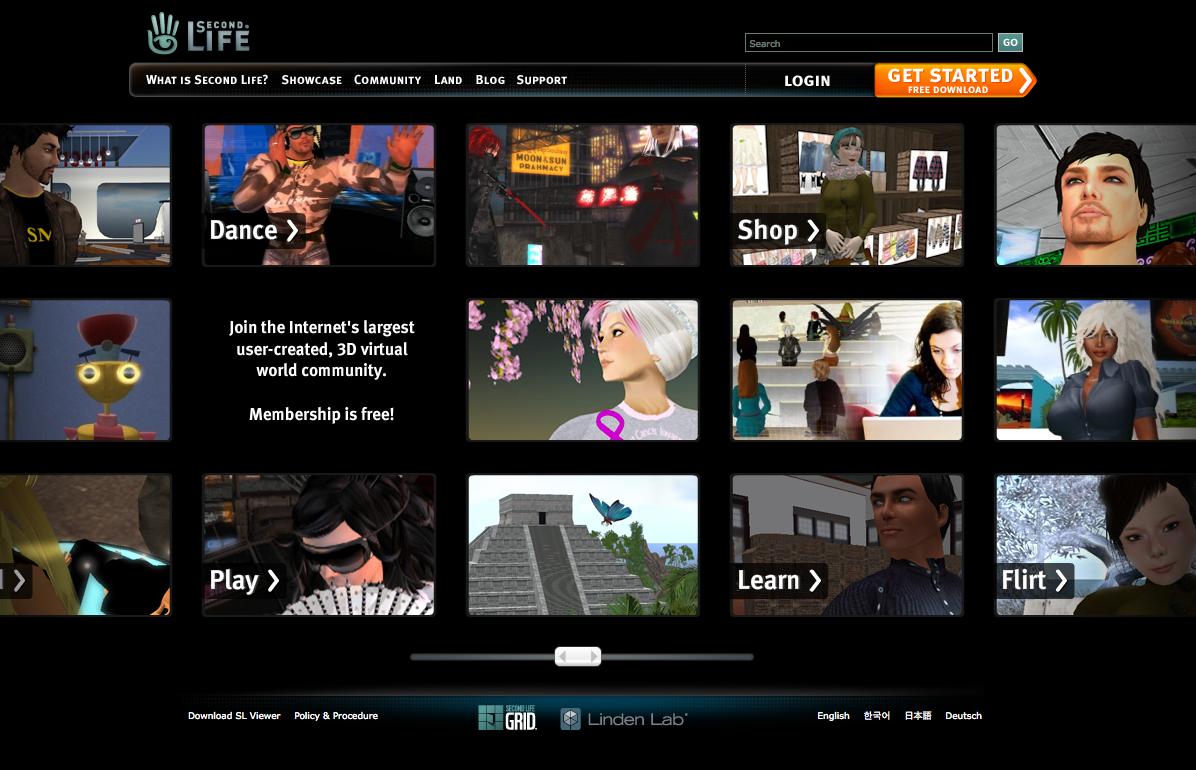
The pods are dead. Those little postcard box things on the Second Life home page have finally been put to pasture….not without the benefit, I suppose, of knowing what buttons people clicked on and that shopping was more popular than sailing or whatever it was. I called it a photo booth - and was never a fan:
“Second Life is now a giant photo booth. A photo booth where you scrawl little words on the pictures or whatever so you remember them years from now, or you were too drunk that night, or you couldn’t really remember WHO the person was beside you, on the left, you just know their name was Sue, or Bob, or Flirt, or Dance.”
The new home page may not be guided by Big C creative, but I personally find it significantly less irritating. What do you think?


Is that the new work friendly attired bot for mainland?
I’m wincing less.
-ls/cm
Hoping that isn’t the only photo they will use, that they will rotate a series and not all will be sexy women
Definitely an improvement, though it still feels too black heavy. Still, far better than what they had.
Much better design. Thank goodness they changed it again. I hated the old design. Yay change by LL… for once
better execution of a lesser idea.;)
Home page? Don’t think I’ve seen in since first opening my account, coming up to 2 years ago.
Now, when I click on my bookmark for secondlife.com, it takes me to a “dashboard”, full of a whole bunch of crap I don’t need (no offense to the ancient Mariner — that Crap I do need).
Still rubbish. Still too much emphasis on the dorky avatar.
“Welcome to Barbie and Ken world.”
“Here you can have your Barbie make sexy with Ken”.
Sad..
They’ve gotta take the emphasis away from the avatar. But it’s probably too late now. SL’s image is ruined already. Then again, with a name like ‘Second Life’ it was always destined to fail.