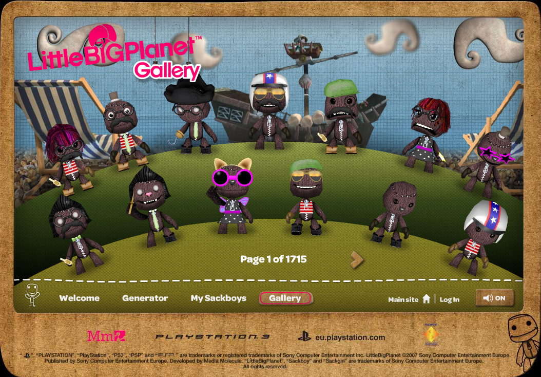
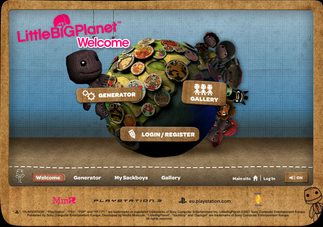
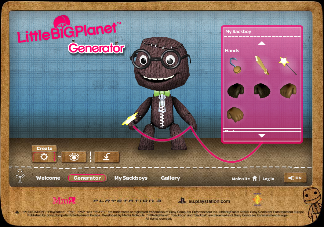
There’s a world, one where users generate their own content, where there’s a sense of awe, of delight even. Now, this world has a Web site to attract people to enter this world. There are all kinds of other ways to attract people: blogs, youTube videos, Flickr streams. But this world, like all worlds, needed a home page to try to describe the experience of being ‘inside’, to try to express its character.
The Web site design uses Flash. Now, that can be a bad thing, or a good thing, depending on your perspective. But they used it.
And what they created was a Web-based introduction to a world in which users are able to actually experience what it’s LIKE, to begin to associate themselves with their avatars, to understand through an interactive experience the little moments of joy that this world represents.
It’s called Little Big Planet. And the site I’m talking about is here.
The Power of Flash
In the case of the Little Big Planet Web site, the designers didn’t JUST use Flash, they used Flash in a way that helped to describe the 3D content of the world it promotes. In fact, they used Papervision, which is as close to a fully immersive 3D experience as you can get in Flash. Users, therefore, get a nice feeling for what the 3D “space” of LBP is actually like.
What’s intriguing about how they approach the introduction to LBP is that they focus on the game character, sack boy. And as odd as that sounds, if you’ve PLAYED LBP, you’ll understand that although it’s a lot like a modernized, sack-like Mario, you still identify with your OWN little sack boy. It’s an extension of you - you get to dress it up, and make it smile, and animate it by moving your controller. It does little dances, and it grimaces when it drags stuff around.
The LBP Web site captures this spirit of identifying with your, well, with your avatar.
It barely even describes the rest of what LBP is about. It goes on the theory that your ability to identify with your character creates a visceral bond with a world that you can only sense through the experience provided - the quirky music, the little fly-down signs.
Community and Sharing
LBP also has a nice little ‘community sharing’ facility. People who surf to the site, create their avatars, can then share them with others.

What’s partly intriguing about this is that the user-generated content of LBP is NOT primarily about your avatar - although that’s a component. It’s about creating game levels. And again, if you haven’t played the game, you wouldn’t understand - and maybe the Web site developers are on to something, because they don’t even SHOW the stuff that you can’t possibly UNDERSTAND.
They show something you can relate to, engage with, play with - and the surrounding design, the audio, the user of Papervision, gives you a FEELING of what’s behind the curtain without even showing it to you.
It’s very well done. It communicates a message. It doesn’t, sorry, over-play its hand. It understands what CAN be communicated in this media and what can’t. It lets the reviewers and blogs and youTube videos to do the explaining stuff and instead creates a little moment of engagement that is very reflective of what it feel like if you play the game.
It’s not unlike Spore. And in fact, I wrote about Spore some time ago, saying:
The point is to get potential users to invest in their avatars FIRST. And through it, teach them some basics. Actually, the avatar customization process is kind of fun. Maybe people don’t even get IN the world. Maybe they just toy around with body shapes all day - and it would be kind of fun if you could EXPORT your avatar to a little Facebook widget or mySpace mini-application.

Second Life Comes Home
In my last post, I expressed my frustration with the missed opportunities in the new Second Life home page design. But Luke commented that with all the negativity, it feels like it puts a damper on change. And that was a valid point. (I think my comments were equally valid, but regardless).
So I was thinking about that today, and I was thinking about Spore, and Little Big Planet, and I realized that while it would be nice if the Lindens had listened to my wise advice of some time ago about avatar creation tools, they didn’t, and if they had the blogger-types would probably be calling them derivative and ripping off games like, well, like Spore and Little Big Planet.
So I thought I’d do a little favor here in the name of karma maybe and fairness. Because after beating my head all day, I came to realize that perhaps the Lindens and Big Spaceship are far more clever than we imagine.
So I’ll share with you an alternative vision of what the new home page represents.
Linden Lab Gets it Right (An alternative interpretation to, um, yesterday)
Here goes:
Linden Lab has very cleverly started the roll-out of a significant shift in how Second Life attracts, builds and maintains community. Recognizing the passion of its user base, and the fact that a significant and perhaps monumental shift towards increased value should be done in stages, with lots of feedback, and lots of testing, the Lab smartly chose the new user landing page as a place to test out some of its early campaign executions.
The Lab has learned the lessons of its competitors, whether in the virtual world or game space, and has recognized that the value of Second Life is that it is, in fact, a world. Few other platforms have the sense of social cohesion and culture that you find here: a place created by its users, that’s free, and that offers a full range of things to do.
But the collage of images on the new Second Life home page is not meant to be a gallery of things that a new user might respond to and want to do: in fact, the new home page represents the platform of a “big idea”. And the big idea is this:
Like a great city - like the Paris or New York of the new digital age, Second Life is a vibrant, creative community. And like those great cities, Second Life will be defined in our collective imagination by the iconography that is both created within it, and shared with others through media, writing, film, and other forms of art.
As a great city, SL will create new forms, new expressions, and those forms and expressions will be shared, even with people who never visit. It will become part of our collective imagination because of the pictures that are shared, the stories that are told, the memories that are scratched out in little blogs at the corners of the Web.
The new home page represents the first step in a project whose goal is to provide the means by which the residents and artists of this great city can continue to collect, share, aggregate, and distribute the myths of this place, of this world.
Practically speaking, the new Web page is a series of images, yes - like post cards from Tokyo, maybe, or like sketches in Florence. But they are also the first hint of a new approach to how users can share with each other and with the wider world their experiences of living in this wondrous place. And hey - if by sharing this, others want to visit, they’re welcome to come in.
The Lab in fact has a whole platform planned, of which the new home page is a first glimpse. This platform is geared towards aggregating the sum of our myths, to allowing residents for example to snap photos in world and not just send them to someone’s inventory or in an e-mail, but to share them with the world, through an interlinked ecosystem of tools that includes cell phone applications, widgets, the Web site, social networking applications, and personalized “avatar portfolios” through which content can be shared, friendships formed, groups made, projects planned, and cultural identity articulated.
The home page gives a glimpse at one slice of this grander strategy to create a network of ways in which the expressions from WITHIN the world can be annotated, distributed, posted, embedded, searched, shared, and aggregated.
A year or two from now, this strategy, which has its humble start in a home page that gives one glimpse of how much STUFF there is, by making the depth of this accessible through the metaphor of the photo, will enable Second Life to not only remain a leading virtual world, but to actually replace the Web itself, or many forms of it.
Because in creating a platform, by allowing users to create content on it, and by then beginning the visionary yet difficult process of bringing shape to the VAST amount of knowledge and content and the ways in which residents can propagate that content, Second Life is headed to becoming the largest database of KNOWLEDGE in the world. Something more vast, perhaps, than Google, because it will have deeply embedded social relationships, 3-dimensional objects, scripts, and new forms for the expression of ideas. This is the type of content that will transform our very understanding of the term “information”.
Kudos Linden Lab for this courageous first step on the path to providing Residents the tools to begin the massive process of sharing their experiences of this world, their snap shots from this creative city. Nay, thanks Linden Lab for allowing us to begin to more richly and meaningfully share the MYTHS arising from this great, emerging culture. It is not only the first step in building an ecosystem of tools and distribution channels for the incredible content within the world, it is another step on the path to changing the wider world for the better.


Dusan, you shared with me your idea of Second Life as a big city a few weeks ago, a center of creativity and productivity, and I thought you made a compelling case. But this would all be more convincing to me if, using your words from the previous post, you could distill it all into a Big C Creative slogan, on the order of “Just Do It” or “Your World, Your Imagination.”
Maybe some of your readers want to take a stab. All I can think of is “That’s life in the big city,” which is what my older brother would tell me when he was stealing my candy and toys. So for me, at least, its not an uplifting slogan.
*chuckle*
WOW!