Tom Hale gave a tour of the new viewer for Second Life, to be launched in the coming months, although finished his chat with the footnote (his speech was highly footnoted) that it has changed since the screen shot and will be different than he presented.
But still, it gives us a pretty good sense of the design methodology, which includes:
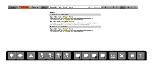
- A browser-type navigation bar with “back” functions so that you can retrace your steps in world, and locations are treated like URLs in a nav bar (SLURLs), including bookmarks etc.
- A right hand panel which opens and closes like a drawer. I couldn’t help thinking of the interface for Z-Brush when I saw this. It promises “no more panel proliferation”. The ‘most used’ features of the viewer are incorporated into the drawer.
- Bottom menu is the most frequently used things in Second Life – gestures, camera controls, chat etc.
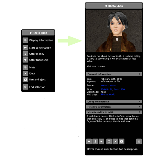
Now, I just thought I’d pop up a screen shot of the winning entry from the UI contest that I held some time ago, the winner of which was Rheta Shan who is no longer with us. I’m not saying there are similarities, but it’s interesting to look back on the approaches the contestants took (read the full post here).
The lower menu bar and panel was slightly reminiscent of her approach:


Do check out her full entry.
After the jump is T Linden’s presentation of the new viewer:
Again, big thanks to HVX Silverstar for getting these videos up!


Sweet, can’t wait! Btw you can download and read about the dev preview here:
http://tinyurl.com/ognz99
Ah yeah – thanks on that JSG – the media thing is sweet, I think Tateru covered it really well on Massively.
http://www.massively.com/2009/08/16/linden-lab-s-tom-hale-announces-second-life-support-for-media-pl/
I use a two-display desktop. I’d love to be able to break panels out of the viewer and park them on my second display. I’d have the world on one display, and chat, the mini-map, the statistics monitor, etc., on the second display.
@ Mitch
I’d just love SL to work on a second display period – I’m sick of turning black then disappearing till all that’s left is my prim hair and a pair of floating eyes…
I think the way the Lab would see that is that you’d have the viewer on one display, and “MySL” on the other (all that Web side stuff). Oh, and Avaline on a third. No indication from the presentation that the panels can be split from within the viewer.
And Eris – I thought I was the only one that happened to!
i too would love to see panels that could be undocked onto a second monitor, like flash and photoshop
but nice moves, i love (!!!) the back btton feature!
[...] I’m a fan of Second Life and have been using it for medical events for a long time. Dusan Writer just shared the new viewer of Second Life with [...]
[...] reminded us that the new viewer’s coming. I’ve personally been waiting for this for over a year. With 50 people working it, sounds [...]